Responsive Images
Responsive images are critical for page performance and they're made easy with the CldImage component.
The CldImage component takes advantage of responsive images generated using the Next Image component (opens in a new tab) which allows you to simply specify the sizes you want and the component handles the rest.
Using the sizes prop, you can configure exactly the sizes you need for your
application, such as a similar example to the Next.js docs:

  import { CldImage } from 'next-cloudinary';

  <CldImage
    width="960"
    height="600"
    src="<Your Public ID>"
    sizes="(max-width: 768px) 100vw,
          (max-width: 1200px) 50vw,
          33vw"
    alt="Description"
/>This would give you roughly full width images on mobile, a 2-column layout on tablets, and 3-column layout on desktop views.
Responsive Images & CldImage
The difference with the CldImage component is that it utilizes Cloudinary tech in order to provide the responsive sizing.
In the example above, the output would look like:
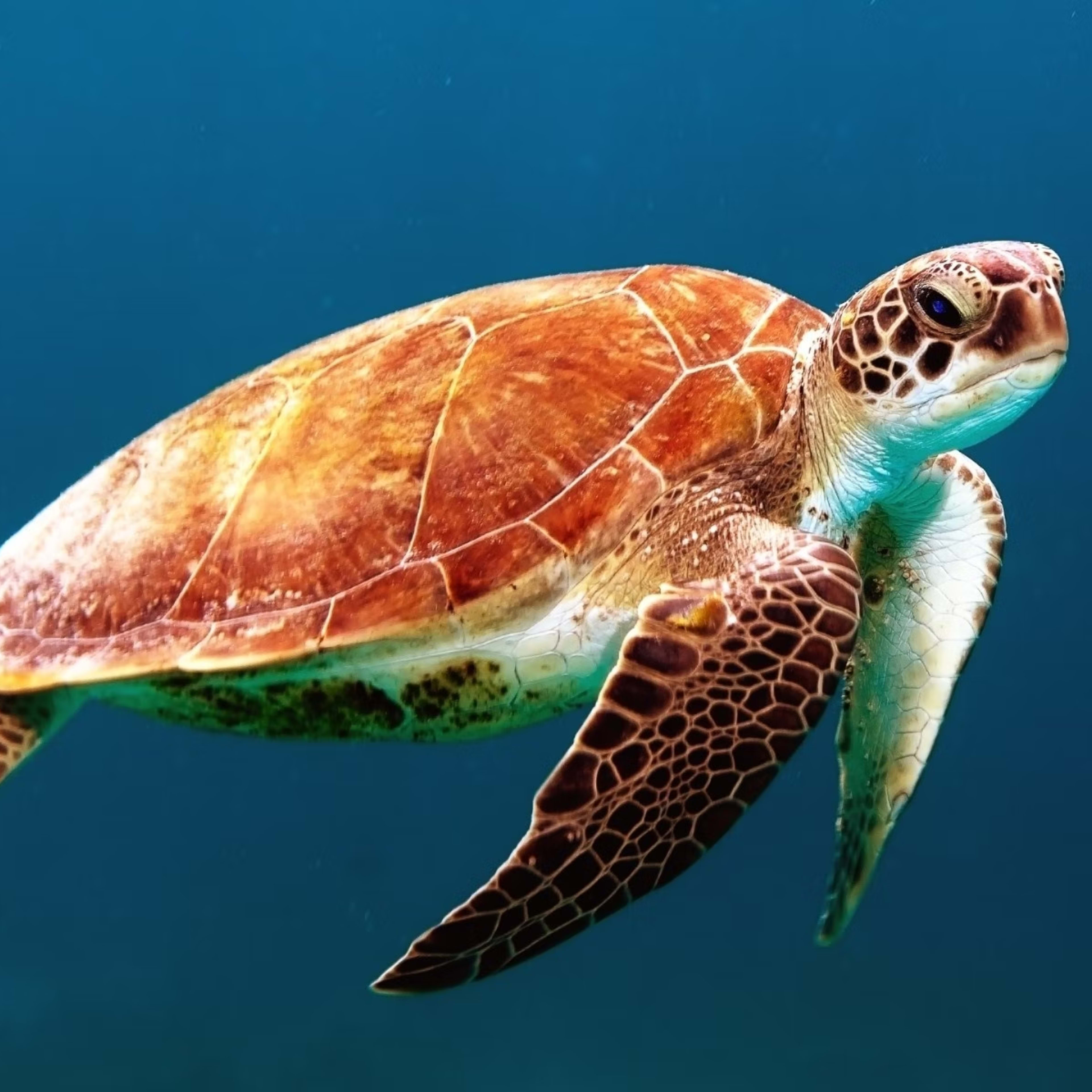
<img
  alt="Turtle"
  loading="lazy"
  width="960"
  height="600"
  decoding="async"
  data-nimg="1"
  style="color:transparent"
  sizes="(max-width: 768px) 100vw, (max-width: 1200px) 50vw, 33vw"
  srcset="
    https://res.cloudinary.com/<Cloud Name>/image/upload/c_limit,w_256/f_auto/q_auto/v1/<Public ID> 256w,
    https://res.cloudinary.com/<Cloud Name>/image/upload/c_limit,w_384/f_auto/q_auto/v1/<Public ID> 384w,
    https://res.cloudinary.com/<Cloud Name>/image/upload/c_limit,w_640/f_auto/q_auto/v1/<Public ID> 640w,
    https://res.cloudinary.com/<Cloud Name>/image/upload/c_limit,w_750/f_auto/q_auto/v1/<Public ID> 750w,
    https://res.cloudinary.com/<Cloud Name>/image/upload/c_limit,w_828/f_auto/q_auto/v1/<Public ID> 828w,
    https://res.cloudinary.com/<Cloud Name>/image/upload/c_limit,w_1080/f_auto/q_auto/v1/<Public ID> 1080w,
    https://res.cloudinary.com/<Cloud Name>/image/upload/c_limit,w_1200/f_auto/q_auto/v1/<Public ID> 1200w,
    https://res.cloudinary.com/<Cloud Name>/image/upload/c_limit,w_1920/f_auto/q_auto/v1/<Public ID> 1920w,
    https://res.cloudinary.com/<Cloud Name>/image/upload/c_limit,w_2048/f_auto/q_auto/v1/<Public ID> 2048w,
    https://res.cloudinary.com/<Cloud Name>/image/upload/c_limit,w_3840/f_auto/q_auto/v1/<Public ID> 3840w
  "
  src="https://res.cloudinary.com/<Cloud Name>/image/upload/c_limit,w_3840/f_auto/q_auto/v1/<Public ID>"
>
Where the image is automatically generated on the fly with Cloudinary by passing
in a URL parameter of w_<width>.
Upscaling Images
By default, the CldImage component uses the limit crop mode which explicitly
prevents Cloudinary from upscaling an image if the size is greater than the original
and instead, opting for the browser to resize the image on its behalf.
To allow Cloudinary to upscale the image and potentially produce blurry images,
you can set the crop mode to scale.
Cropping & Resizing
Part of the benefit of using Cloudinary is access to dynamic cropping and resizing modes.
In an example such as:
  import { CldImage } from 'next-cloudinary';

  <CldImage
    width="960"
    height="960"
    src="<Your Public ID>"
    crop="fill"
    sizes="100vw"
    alt="Description"
/>Each image will be cropped to a 1:1 ratio represented by the width and height provided.
As the underlaying Next Image component generates an image for each responsive size, Cloudinary will use those sizes when building the URL, for example:
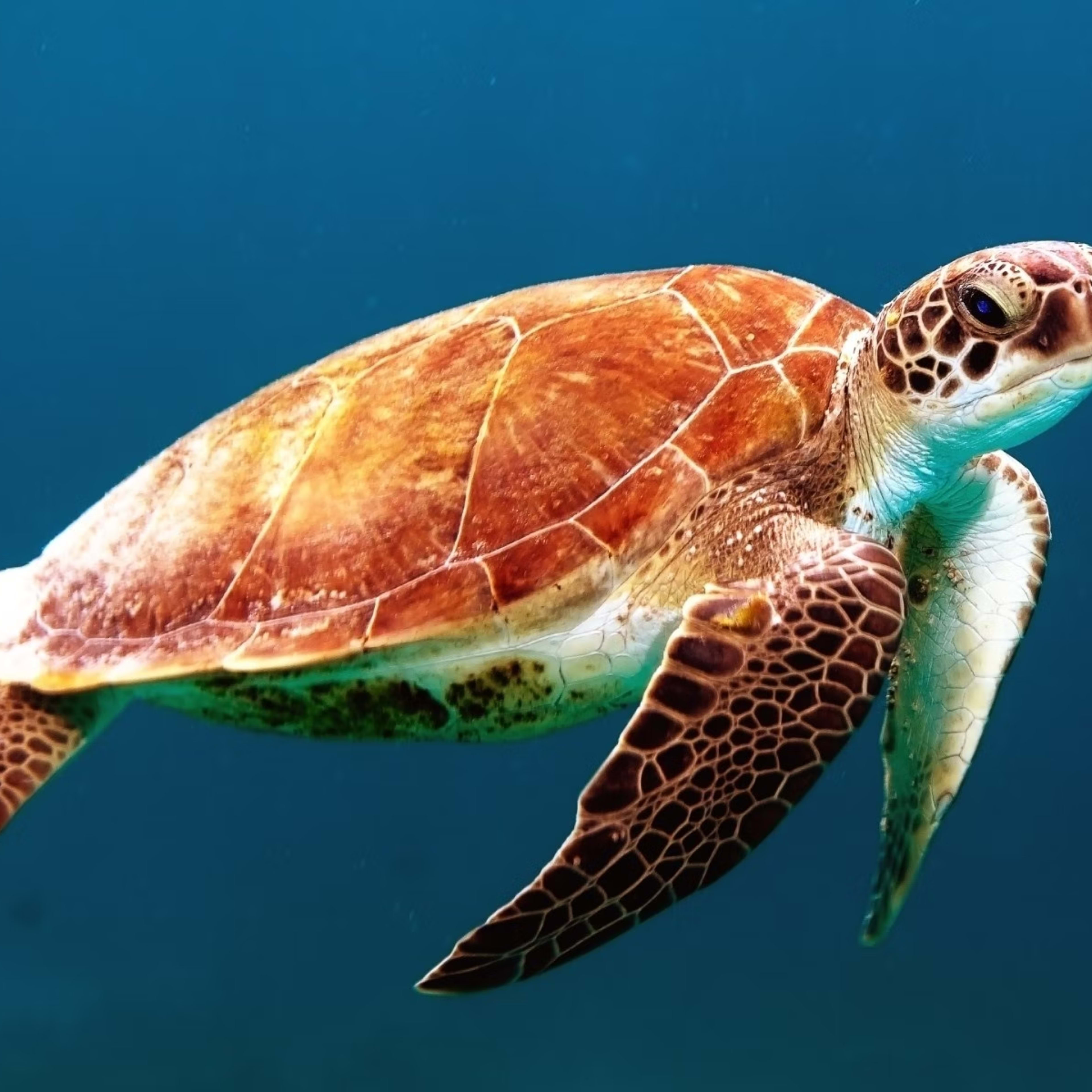
<img
  alt="Turtle"
  loading="lazy"
  width="960"
  height="960"
  decoding="async"
  data-nimg="1"
  style="color:transparent"
  sizes="100vw"
  srcset="
    https://res.cloudinary.com/<Cloud Name>/image/upload/c_fill,w_640,h_640,g_auto/f_auto/q_auto/v1/<Public ID> 640w,
    https://res.cloudinary.com/<Cloud Name>/image/upload/c_fill,w_750,h_750,g_auto/f_auto/q_auto/v1/<Public ID> 750w,
    https://res.cloudinary.com/<Cloud Name>/image/upload/c_fill,w_828,h_828,g_auto/f_auto/q_auto/v1/<Public ID> 828w,
    https://res.cloudinary.com/<Cloud Name>/image/upload/c_fill,w_1080,h_1080,g_auto/f_auto/q_auto/v1/<Public ID> 1080w,
    https://res.cloudinary.com/<Cloud Name>/image/upload/c_fill,w_1200,h_1200,g_auto/f_auto/q_auto/v1/<Public ID> 1200w,
    https://res.cloudinary.com/<Cloud Name>/image/upload/c_fill,w_1920,h_1920,g_auto/f_auto/q_auto/v1/<Public ID> 1920w,
    https://res.cloudinary.com/<Cloud Name>/image/upload/c_fill,w_2048,h_2048,g_auto/f_auto/q_auto/v1/<Public ID> 2048w,
    https://res.cloudinary.com/<Cloud Name>/image/upload/c_fill,w_3840,h_3840,g_auto/f_auto/q_auto/v1/<Public ID> 3840w
  "
  src="https://res.cloudinary.com/<Cloud Name>/image/upload/c_fill,w_3840,h_3840,g_auto/f_auto/q_auto/v1/<Public ID>"
>
And so on...
Dynamic Cropping Modes
While some cropping modes will "just work" with responsive sizing, others won't.
For instance, the crop mode of thumb will dynamically crop an image based on its
size and contents, meaning the resulting crop of a 256x256 image may be different
than a 640x640 image.
  import { CldImage } from 'next-cloudinary';

  <CldImage
    width="960"
    height="960"
    src="<Your Public ID>"
    crop="thumb"
    sizes="100vw"
    alt="Description"
/>The resulting transformations may look like:
.../w_256,h_256,c_thumb/...
.../w_384,h_384,c_thumb/...
.../w_640,h_640,c_thumb/...
.../w_750,h_750,c_thumb/...
Try resizing the browser to very small, refresh the page, then increase the browser size to see the differences.
This produces inconsistent results depending on the size of the device, which isn't a great experience.
To help give visitors that great experience, we can crop our image in two stages opting to crop an image before any transformations are made, then allowing the responsive sizing to resize the result.

  import { CldImage } from 'next-cloudinary';

  <CldImage
    width="960"
    height="960"
    src="<Your Public ID>"
    crop={{
      type: 'thumb',
      source: true
    }}
    sizes="100vw"
    alt="Description"
/>Tip: By default, using an object for crop will derive the width and
height from the top-level width and height, but you can customize those
values by explicitly setting them.
The resulting transformations may look like:
.../w_960,h_960,c_thumb/<Other Transformations>/w_256,h_256,c_limit/...
.../w_960,h_960,c_thumb/<Other Transformations>/w_384,h_384,c_limit/...
.../w_960,h_960,c_thumb/<Other Transformations>/w_640,h_640,c_limit/...
.../w_960,h_960,c_thumb/<Other Transformations>/w_750,h_750,c_limit/...
Try resizing the browser to very small, refresh the page, then increase the browser size to see it is now consistent.
By using object-syntax for the crop prop and setting source to true, we
are specifying that we want the crop transformation to be applied to the
source image.